Day trading is a very popular way for people to participate in Forex trading as there are lots of small moves that you can potentially capitalize on and really compound your gains.
But what should your trading strategy be and which time frame should you use when day trading Forex?
In this post, we’ll break down some of the most popular time frames for day traders and explore their pros and cons.
Which is the best day trading time frame?
Of all the chart time frames out there, it’s difficult to point to any single one as the best time frame. Every time frame has its advantages and disadvantages.
1 minute chart
The one minute chart is very popular among day traders because of the wealth of new data that comes in.
A new candle prints every single minute, so there are lots of potential signals that you can capitalize on.
However, there’s also a lot of noise in the one minute time frame, so it’s easy to get caught up in small movements and lose sight of the bigger picture.
For example, the one minute chart may look extremely bearish and you may be tempted to only look for short trades, but the overall trend direction for the day is bullish and you’d actually be better off looking for longs!
That’s because support and resistance zones created on the one-minute chart are not as strong as zones created on bigger time frames.
In general, the bigger the time frame, the stronger the zone will be.
There are many trading strategies that focus on the one minute chart and some traders are very successful exclusively trading this time frame.
One of the advantages of executing your trades on the one minute time frame is that you can find very targeted entries that require comparatively smaller stop losses and the potential for huge risk-reward ratios.
Well-known traders that have found success on the one-minute timeframe include FTMO One Minute Mastery and TechnicalGods.
Even if you just have a two hour trading window, that’s still 120 candles on the one minute chart and plenty of trade signals depending on your strategy.
Main takeaway
The one-minute chart can be used for executing really tight entries, but finding those zones requires a lot of practice. Without experience or risk management, the one-minute chart is a recipe to blow your account.
5 minute chart
The 5 minute time frame is slightly more reliable than the 1 minute time frame and it is one of the most popular day trading time frames for many professional traders.
Since the 5 minute chart prints a new candle every 5 minutes, there are still a decent amount of potential signals that you can get in a trading day with this time frame.
However, like the one minute time frame, the 5 minute time frame also has the same drawback of creating support and resistance zones that are not too reliable.
The 5 minute time frame is still “noisy” compared to larger, cleaner time frames.
Like the one minute chart, the 5 minute chart can be used to find sniper entries based off of higher time frames.
YouTuber Day Trading Addict uses the 5 minute time frame to execute most of his entries, though he does find his zones using higher time frames.
It is possible to build a strategy around this time frame too as long as you backtest it well and create rules that help you eliminate false signals.
Main takeaway
The 5 minute chart is slightly more reliable than the one minute chart and is great for day trading Forex as long as you have a good system and you align high time frame zones within the 5 minute time frame. There will be plenty of trading opportunities throughout the day.
15 minute chart
The 15 minute chart is excellent to trade because you can use it for swing trading and day trading.
Of course, you’ll see fewer traders in this time frame rather than on smaller time frames, but the signals you get will be more reliable.
If you sit for the entirety of one trading session(around 6 hours), you may get one or two trades per day.
This is because there will only be 24 candles in the whole 6 hours, so it will be easier to catch the primary trend of the session rather than smaller price movements in between.
The 15 minute time frame is a really good chart time frame because it’s more relaxed than the smaller charts.
Since a new candle only prints every 15 minutes, you can simply check the charts once every 15 minutes to see if a signal has developed or not.
One drawback of this time frame however is that the support and resistance zones are still not quite as reliable as bigger time frames.
Main Takeaway
If you don’t mind taking fewer trades every day, you can still make money trading the 15 minute time frame. Profitable forex trading is not about taking lots of trades, but it’s about taking one or two good trades.
30 minute chart
The 30 minute chart is where things get really interesting.
Since every candle on a 30 minute chart is a whole 30 minutes of trading activity, these signals are very reliable and that’s what actually makes this the best chart time frame to use for both day trading and swing trading.
There are enough data points for a day trader and a swing trader to capitalize on here.
During regular trading hours, you can expect about 12 candles if you sit for 6 hours a day.
The biggest advantages of the 30 minute chart are that the support and resistance zones are much more reliable and you require less constant focus since you only need to check the chart once every 30 minutes to see what’s going on.
The 30 minute time frame is also very effective for price action trading because the zones are so strong. If a 30 minute candle is creating higher highs and higher lows, or lower lows and lower highs, you can be fairly certain that the market is in a trend.
Trading frequency will be much less on this time frame, but you’ll be able to catch bigger intraday trends all while not needing to spend hours staring at the charts.
Trading decisions based off of this time frame will ideally be much more reliable.
Main Takeaway
The 30 minute time frame is great for both swing traders and for day traders, and can even form the starting point for using multiple time frames to analyze the day’s movement in the markets.
1 hourly chart
The one hour chart is like the grandfather chart of day trading time frames.
In a typical trading day, you’ll only see 4-6 new candles being printed, so it’s difficult to base your trades solely off of the one hour chart.
However, price bars on the H1 timeframe are highly reliable and the zones created will very likely be respected.
That’s what makes the H1 a good place to start your analysis.
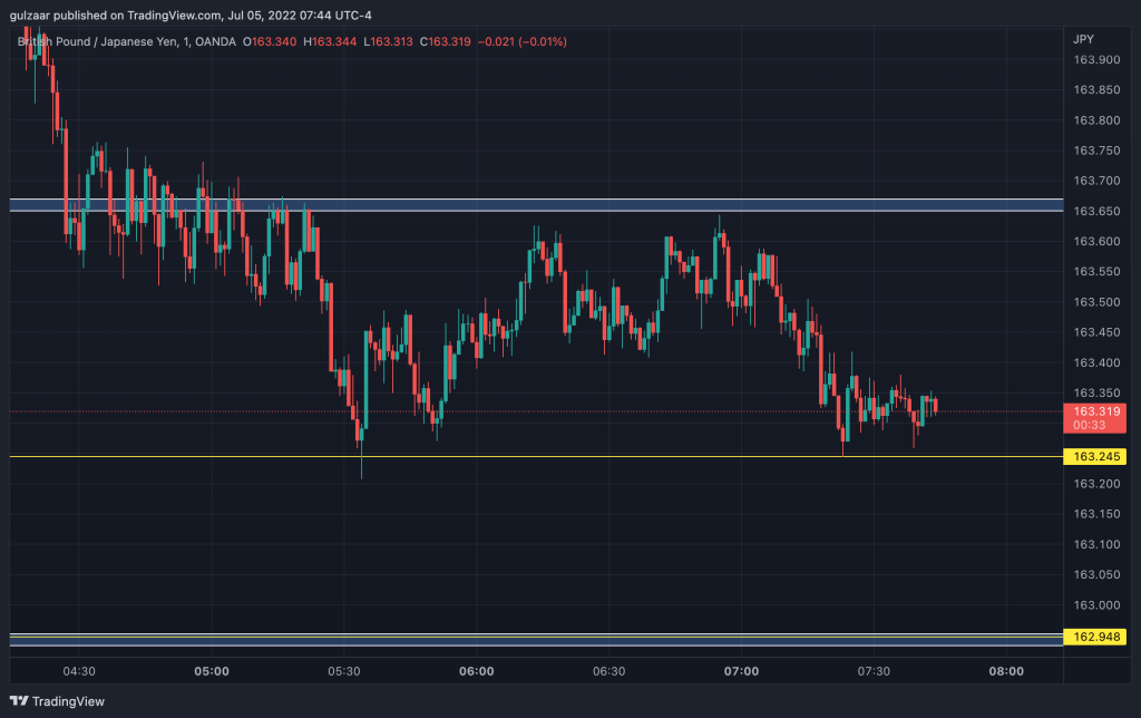
The H1 also gives you an opportunity to get into swing trading, since it’s not uncommon for some pairs like Gold and GBP/JPY to start a swing on the H1 chart that finishes hundreds of pips later.
Main Takeaways
The H1 chart is a good place to start your analysis since there are fewer data points and thus less noise on the charts.
It may not suit all trading styles as there’s not much action on the chart every day, so if you’re looking for wild swings, the H1 chart may be too slow for you.
Multiple time frame trading
A well rounded trading strategy will take multiple time frames into account. Ideally, you can start at the weekly charts or daily charts and then work down until you get to your target time frame to trade on.
Looking at the longer period time frames will give you a better idea of what the market wants to do as a whole, so you can capture bigger and more probable moves.
Are there any other time frames?
MT4 and most other major trading platforms support the timeframes I have listed here. If you’re on the TradingView Pro and higher plan, there are a lot more time frames that they offer ranging from 15 seconds to 2 hours, 3 hours, 8 hours, and more.
While some people do use those for multi time frame analysis, fewer traders look at them overall, so it’s better to stick to the more common time frames for your technical analysis.
Alternate charts
If you’re not into time-based charts, you can also trade other types of charts like tick charts and Renko charts.
In tick charts, a bar is formed when there have been a certain number of transactions. When the market is slow, a bar may take a long time to form, but when the market is really moving, bars can form very quickly.
Renko charts form when price moves a certain amount. As long as price moves in one direction, Renko charts will keep forming. Once the price reverses as much as two previous bricks, the bricks change colors and will reverse.
Renko and tick charts have their place, but most traders tend to stick to regular Japanese candlestick charts or Heiken Ashi charts.
How I trade
I am a day trader, but I don’t like to go lower than the 15 minute time frame when I trade. My analysis starts at the daily chart and I work down to the 30 minute chart to find potential trading opportunities.
If the 30 minute chart is printing really big candles, I may dip down to the 15 minute as well to find a trading opportunity.
I only sit for 2-3 hours at the very most, and my goal is to find one or two trades of 10-15 pips each.
One of the biggest catalysts towards me starting to find success in trading was to limit the number of trades I took every day.
That’s why I usually close the charts after one or two trades, no matter if they were successful or not.
I’ve tried to swing trade many times but I rarely am successful and I find that taking 10-15 pips and walking works out much better for me in the long run.
Related:
Conclusion
The best time frame for day trading really depends on your particular trading style and strategy, but it’s important to backtest(or forward test on a demo account) and really see how your strategy plays out over a period of time.
Another pitfall to watch for when day trading is that day traders focusing too much on short term charts risk losing sight of the bigger picture. When in doubt, always go up a couple of timeframes and see what’s going on.