Japanese candlestick charts are some of the most commonly used charts by traders all over the world. Candlestick charts are very versatile and show a lot of data in a compact and easy-to-read manner.
In this post, we’ll take a look at what Japanese candlesticks are and how to utilize them for your trading.
What are Japanese candlestick charts
Japanese candlestick charts are a way of visually displaying price movement. Line charts, bar charts, and candlesticks all represent price movement in some way, but candlestick charts are what most traders prefer.
Every candlestick on a price chart represents price movement for a given period of time. This depends on the timeframe that you choose.
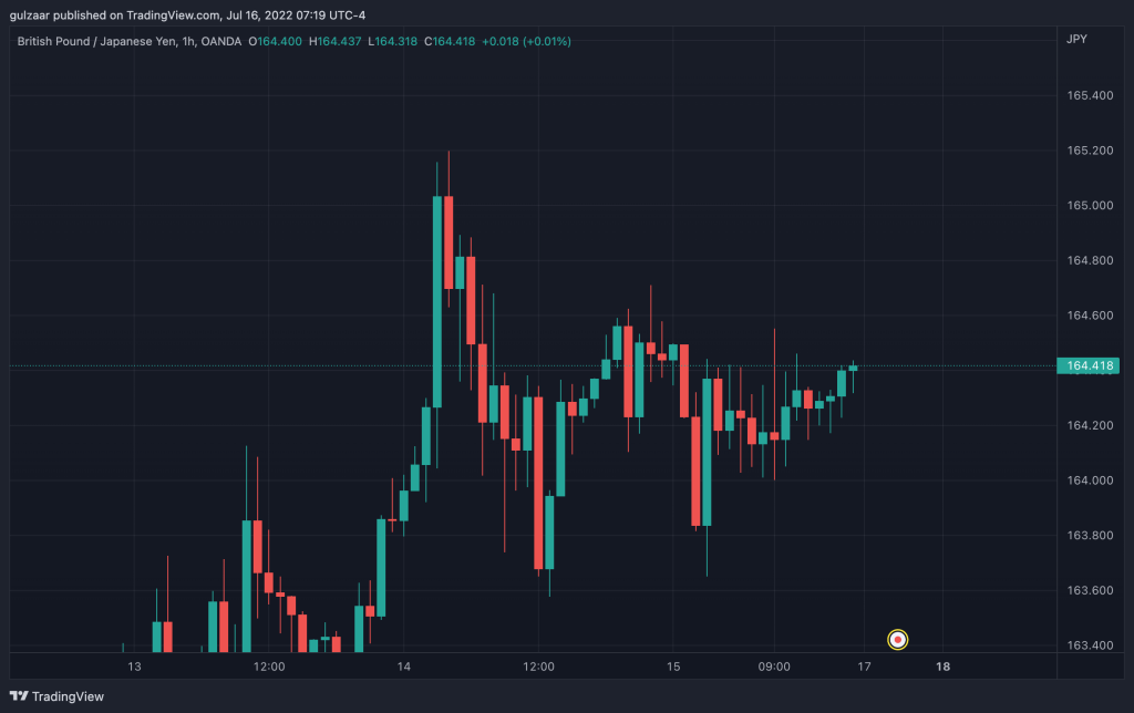
For example, on a one hour chart, every candlestick represents one hour of price movement.
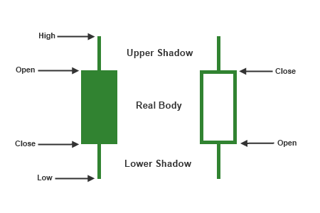
One a daily chart, every candlestick represents an entire day of price movement. By looking at a single candlestick, you can see 4 important data points:
- the opening price
- the closing price
- the highest price went
- the lowest price went
Additionally, depending on the direction the price moved, candlesticks will change color.
Japanese candlestick colors
Most candlestick charts use green to show bullish candles and red to show bearish candles.
This is not fixed, though, and you can change the colors to whatever you prefer.
The only important thing is that you must use distinct colors for bullish and bearish candles, otherwise the price becomes impossible to read!
As a candle progresses, the color changes in real time to reflect whether it’s bullish or bearish.
For example, if price started at $1.010 and moved up to $1.011, the candle body would be green, but if price dipped to $1.005, the body would turn red.
When the time period finishes, the final candlestick is printed on the chart and a new candlestick forms.
How to read candlestick charts and candlestick patterns
Every single candlestick on a candlestick chart shows you a lot of data which you can utilize to make trading decisions.
There are four main parts to a candlestick:
The opening price.
The closing price.
The upper shadow or upper wick, which represents the highest price went.
The lower shadow or lower wick, which represents the lowest price went.
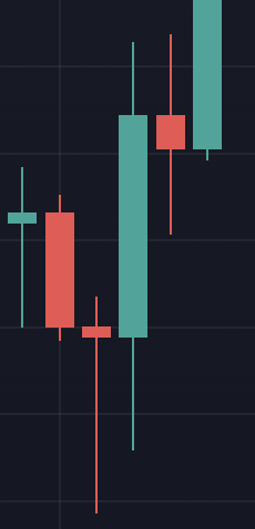
The beauty of the candlestick is that you can tell an entire story about what happened during a time period.
You can see how far price went up or down, whether the move was sustained, or whether there was a big rejection to either side.
You can also see if the move to one direction was sustained or whether momentum was weak.
Generally, strong momentum indicates lots of volume and buying/selling pressure.
Large wicks in the direction of the prevailing trend indicate that momentum may be dying down.
Large wicks opposite the direction of the prevailing trend indicate that price tried to reverse but failed.
Doji candles
Doji candles are candles that have very small bodies.
This indicates that price opened and closed at very similar levels. There are lots of different types of doji candles, and they have fancy names like shooting star, hammer, pin bar, and more.
While covering every type of doji candle requires a post of its own, I will go into what kind of information you can glean from doji candles.
Doji candle with similar top and bottom wicks
A doji candle(small body) with top and bottom wicks of roughly the same size can be thought of as null candles.
This is because nothing really interesting happened in this entire time period!
Price opened and closed at nearly the same place, and there was no extreme movement in either direction.
When analyzing the charts, you can pretty much ignore these types of doji candles.
Bearish Doji candle with a long upper shadow
A bearish doji candle with a long upper shadow suggests that price tried to push up, but sellers stepped in and pushed price back down.
Depending on where these candles are, they can represent potential reversals or completed retracements.
If this type of candle prints after a series of bullish candles, it suggests that buyers are now exhausted and sellers may step in.
If this candle appears after a series of bearish candles, it means price tried to retrace, but was pushed back down, signal possible continuation.
Bullish Doji Candle with long lower Shadow
This candle is the opposite of the candle above.
When this candle prints after a series of bearish candles, it suggests that the downward push is losing steam and bulls may step in to push price back up.
When this candle prints after a series of bullish candles, it suggests that there was a retracement and buyers have now stepped back in to push price up.
Bullish engulfing pattern
A bullish engulfing pattern occurs when there are a series of bearish candles followed by a big bullish candle that completely covers the previous bearish candle.
This indicates that price was moving down, but bulls stepped in and completely blew the bears out of the water, coming in strong.
A bullish engulfing pattern is a signal that price may reverse and start to go up.
Bearish engulfing pattern
A bearish engulfing pattern occurs when there are a series of bullish candles followed by a big bearish candle that completely covers the previous bullish candle.
This suggests that price was going up until bears stepped in and push price down very strongly.
Respecting previous highs and lows
In all financial markets, trends are typically presented as making a series of higher highs and higher lows in an uptrend and lower highs and lower lows in a downtrend.
If you observe series of bullish and bearish candles, you’ll also see that sequential candles form lower highs and lower lows and higher highs and higher lows.
In an uptrend, the candle following a bullish candle should respect the previous candle’s low and break the previous candle’s high.
In a downtrend, the candle following a bearish candle should respect the previous candle’s high and break the previous candle’s low.
As long as candles are doing this, price can be considered trending.
When the highs or lows are broken, it suggests that the trend is losing steam.
In an uptrend, you’ll expect that the previous low will be respected. If the previous low is broken, it suggests that the trend may be weakening.
In a downtrend, you’ll expect that the previous high will be respected. If the previous high is broken, it suggests that the trend may be weakening.
Candles without wicks
Candles without wicks are really interesting beasts.
Bullish candle with no bottom wick
A bullish candle with no bottom wick indicates that there was not even a single seller when the candle opened.
This suggests very strong buying pressure.
Bullish candle with no top wick
A bullish candle with no top wick is when price abruptly stops moving up at the end of a trading period.
You’d usually expect a bullish candle to be followed by another bullish candle, but if a bullish candle closes with no top wick, the next candle often forms bearish.
Bearish candle with no top wick
A bearish candle with no top wick represents a trading period where there were no buyers and sellers were in total control at the start of the candle. This suggests strong selling pressure.
Bearish candle with no bottom wick
A bearish candle with no bottom wick is an abrupt halt in price movement, just like the bullish candle with no top wick.
Candle sizes
Candle sizes are very important indicators of volume in the market. As long as candles have decently sized bodies and are moving in one direction, it suggests that there is good volume in the market.
Once candles start become smaller and smaller, it shows that the trend is slowing down and may reverse.
Should you wait for candles to close?
There are two schools of thought regarding whether you should wait for candles to close or enter a trade as soon as price touches your target area.
One school of thought holds that you should enter right as price touches your area, since price can shoot in your direction from there, and if you wait for a candle close, your stop loss will be too far away.
Another school of thought holds that you must wait for candles to close because only then do you have a confirmed move. Otherwise, what may seem like something at one point in time can reverse on you and stop you out.
Additionally, candles may tap into a level of support or resistance, but you don’t know if they will break the level or go back above or below it unless you wait for the candle to close!
Conclusion
Candlestick charts are much better than line charts because of the extra data that they show. Knowing how to read candlesticks and using that information to see what the market is doing and where it is going is a critical skill to develop in order to become a successful forex trader.